How to Choose the Perfect Wedding Colours
— By Felicity Newburry
10 February 2017
Colour is fun to experiment with, especially when you're in the process of planning your wedding!
The challenge arises when the time comes to settle on a colour palette for your big day. You want your palette to say the right things and speak genuinely of you and your beloved. This article is here to help with this, so read on and get in on this awesome palette choosing process!
Image by Fund Your Wedding
Prioritise!
To avoid any clashes down the road, prioritize settling on your colour palette before doing anything else. Don’t go choosing a venue, dress shopping or printing invitations until you’re happy, excited and settled on your palette. When these tasks are done before the palette is chosen, problems arise such as the venue or the dress not gelling with the colour scheme, or invitations not matching. Wedding planning needs to be done in baby steps, not leaps and bounds, so it makes sense to decide on the colours first.
Get Geared Up!
Before you get started, make a quick stop at your local D.I.Y store and grab yourself a basic colour wheel. While you’re there, pick up as many of those free colour swatches as you can. These are excellent examples of entire colour spectrums and will really help you when you start creating a vague picture of what colours you might like to see on your big day.
Who are you?
If you want your colour palette and your décor to be truly in sync with you and your partner, the following exercise is the best way to figure out what colours bring out the best in both of you on a personal level.
When you’ve got your colour wheel, sit down with your fiancé and ask yourselves “If I had to put myself somewhere on this colour wheel, where would I go?” You’re doing this to figure out which colour you truly identify with. Don’t worry if you feel you’re a more subdued version of a certain colour on the wheel, because we will get to this later!
Think about the kind of people that you and your fiancé are. Maybe you’re adventurous types, or perhaps you prefer a good book and a decent coffee? If you’re the former, then pastels won’t really resonate with you’re personalities, but bold colours certainly will! If you’re the latter, then this might be the other way around.
Your personalities are also clear indications of what feelings you want your colours to provoke. If you’re red wine drinkers who like to travel and enjoy a waltz on a Saturday evening, then perhaps a strong navy blue and pale gold palette will suit you. Your adventurous spirits are reflected in the blue, while the gold adds the elegance you both enjoy.
Image by Sweet Events Photography
Match It!
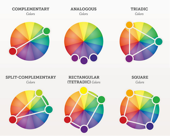
When you’ve figured out the colours that you and your partner love and best identify with, it’s time to see if these colours work for you aesthetically. This is where you’ll bring out that colour wheel you picked up earlier. The colour wheel has three ways of helping you figure out what colours work together best.
○ Complementary Colours
If you and your partner's colour choice are directly opposite each other, then this is a match! Complementary matches are made when one colour is the perfect opposite of the other, such as yellow and purple.
○ Analogous Colours
The second kind of match is when your colour sits directly next to your partner’s colour. Analogous matches happen between neighbors on the color wheel such as yellow and yellow-green or yellow-orange. With this sort of match, you definitely want a strong neutral – so instead of black suits and a white dress, perhaps the males of the bridal party will wear white suits as well? This will give your neutral tone more strength, enhancing your analogous palette.
○ Triad Colours
To figure out if you have a triad match, start at one of your colours and draw an equilateral triangle from this colour to two other points. If one of those other points is your partner’s, you have a match! With the assistance of this third hue you’ll have a solid and versatile palette.
If you haven’t gotten one of these three matches on the colour wheel, it’s not the end of the world. It may just mean that your chosen colours aren’t as strong a match as some other pairings or triads may be. Done well, there really isn’t such a thing as a clash, just be sure to balance everything out with a solid neutral if this is the case.
Image by Simply Bloom Photography
Work It!
When you’ve got your matched colours thanks to the colour wheel, it’s time to bring out those free colour swatches. If you and your partner had a complementary match of yellow and purple, look at those two colour spectrums and find the shade that each of you really love. Perhaps that means you want a brighter purple and a paler yellow, or maybe you want pastel versions of both. This is the exciting part where you get to truly see your wedding palette coming together.
Lock It In!
Cut your chosen colour swatches out and glue them down on a blank piece of card, along with a colour swatch of your dress and/or suit to be. This will help things come together in your mind! Traditional bridal outfits in black, grey, cream or white goes with everything! We are seeing some blush and taupe wedding dresses coming though, so be sure to check your palette feels harmonious when put next to your dress colour if it isn't white.
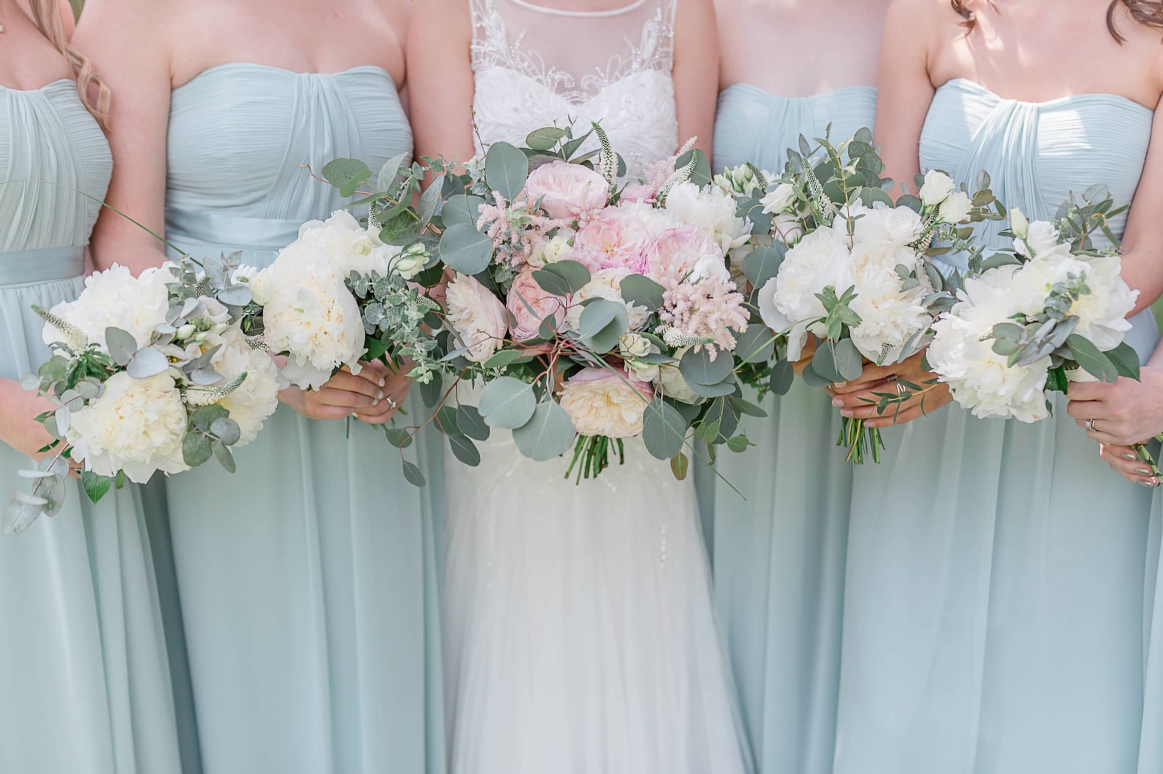
Image by Kate Hennessy Photography
Be Excited And Go Forth!
If you’ve done all of the above, then you have in your hands the perfect, matching and harmonious colour scheme for your big day! Not only will it look great aesthetically but it speaks for both you and your loved one in a special, genuine way! Now you can let loose on the bridal stores and venues, but in doing so, be sure to stay true to your palette. Know that a little gradient is okay here and there, but because you’ve decided to do a couple's colour match, leave gradients to single colour palettes and avoid too much of this. Look for items and places that will not only work with your palette but also enhance it. Have fun!
Examples
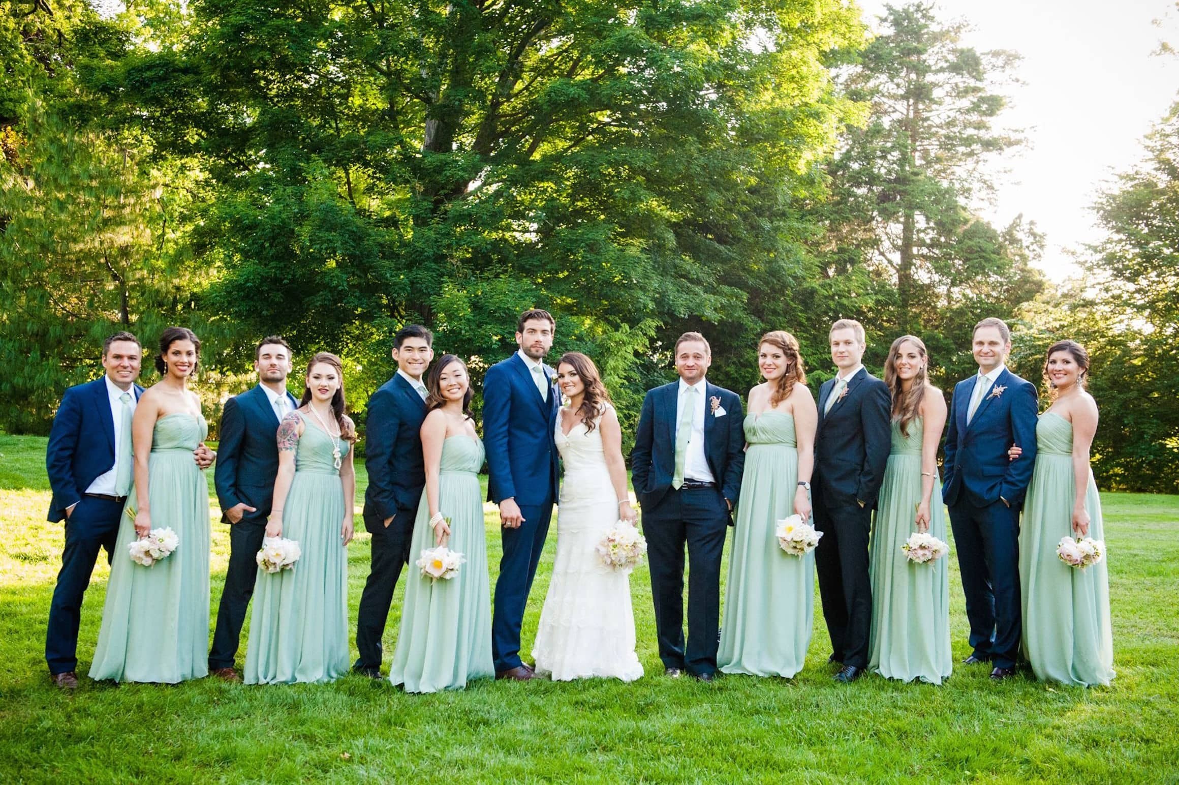 Image by The Knot
○ Analagous Colour Palette
In these great examples of analagous colour palettes used at weddings, they are either delivered in strong blocks of colour or with strong neutrals. It is by doing this that analagous colours are really able to shine, without washing together too much.
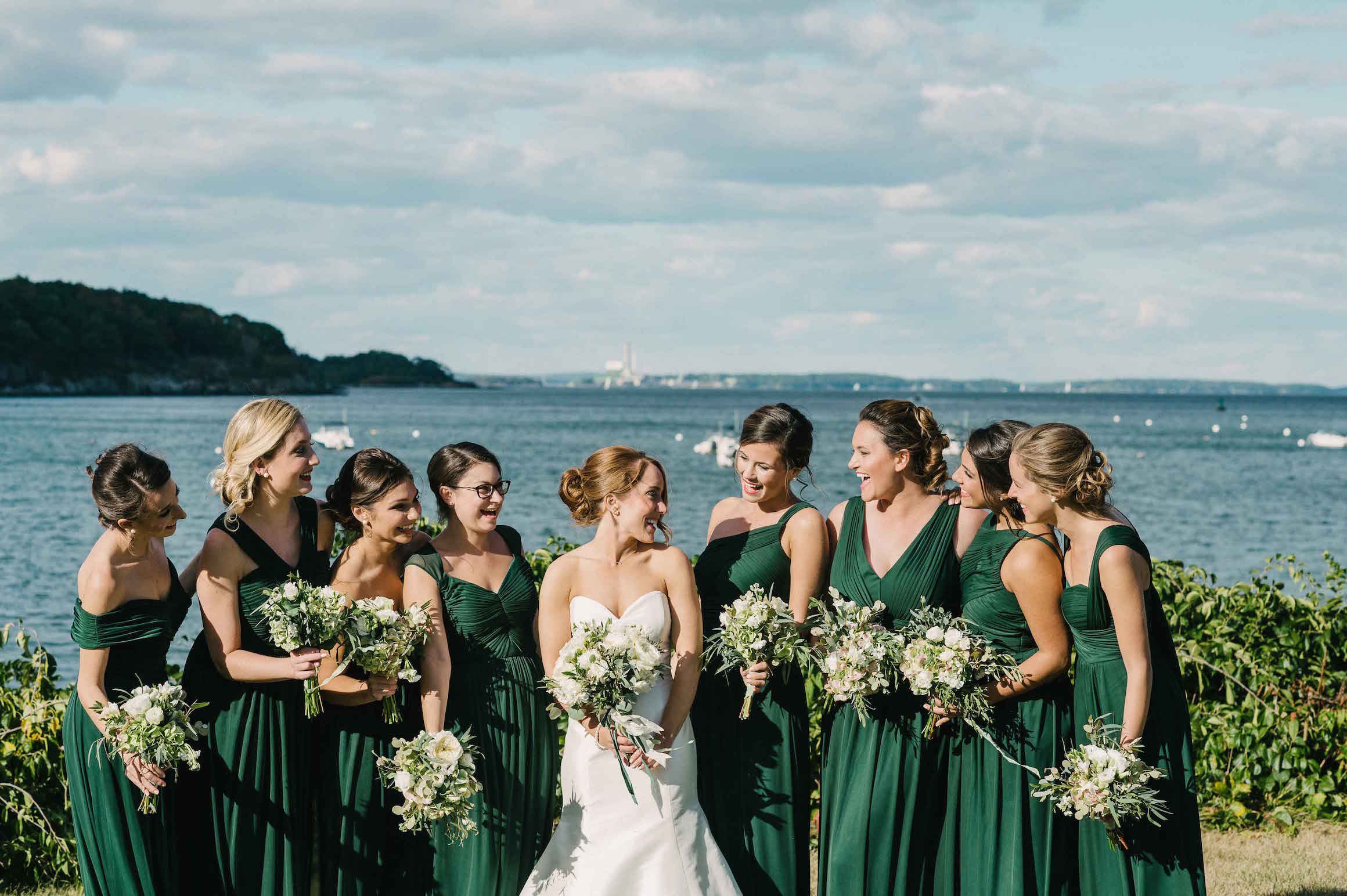
Image by Inside Weddings
○ Complementary Colour Palette
As you will be able to see, these complementary colour palettes are hands-down the boldest examples here. This is because together, complementary colours are stronger than they are alone. You don't need to worry too much about your neutral base when using a complementary colour palette.
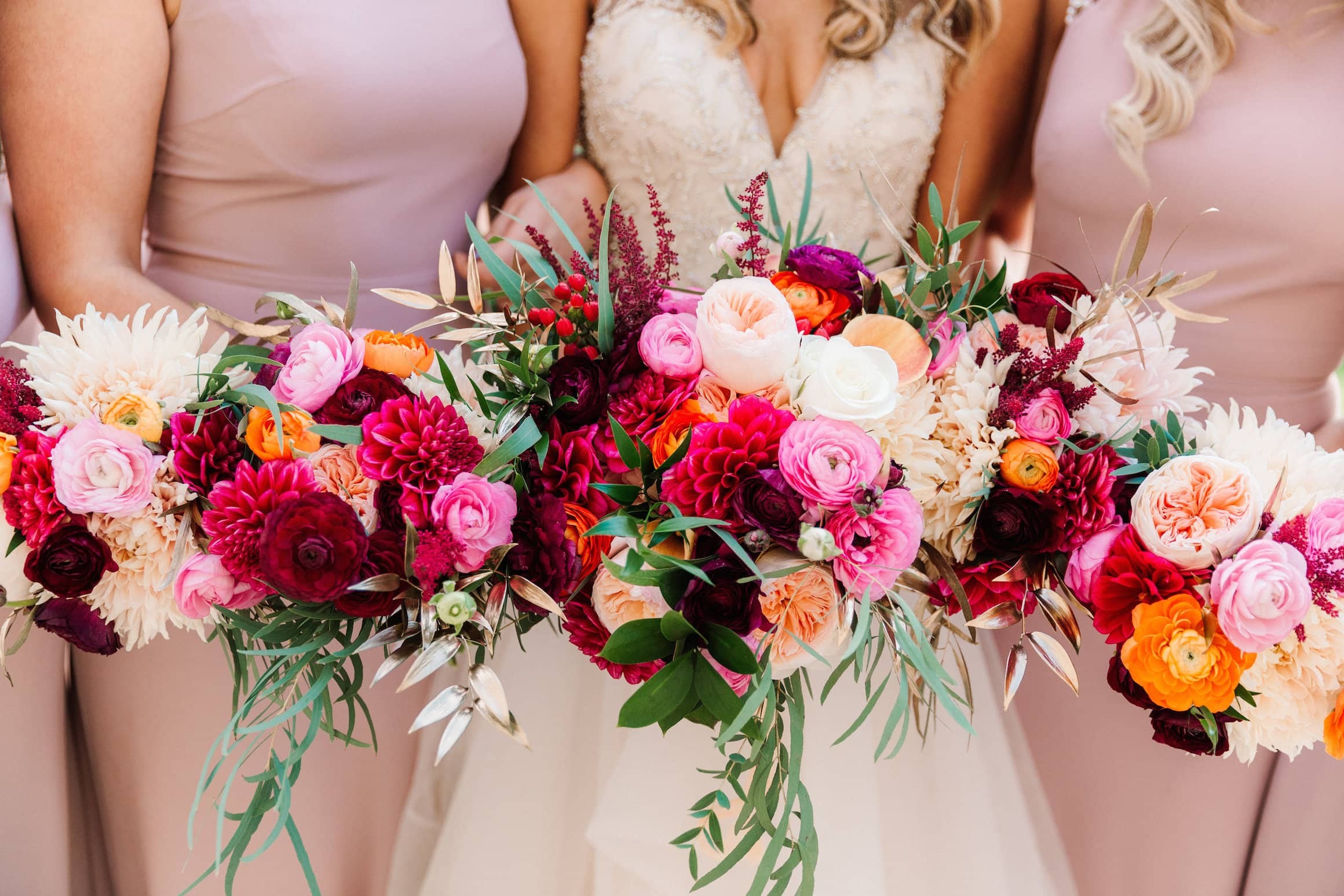
Image by Lynsey Doran Photography
○ Triad Colour Palette
If you imagine taking away one of the colours from the below triad palette example, you should be able to see what we mean when we say that the two colours in the triad are not as strong without the third. You should be able to see how the inclusion of that third colour, such as the blue in the blue/red/yellow example below really lifts the palette. Without it, the red and yellow would look a little mis-matched.
